Bluzun.
Branding | Identity | Branding | Environmental Graphic Design | Web Design
Cryotheraphy and tanning revamped.
The Texas Tan needed a new identity that could represent its growing portfolio of services. Cryotherapy in particular needed to be a part of the new identity. The new brand also could not be location-specific in order to work well across multiple markets.
Yellow and blue a play on symbolism.
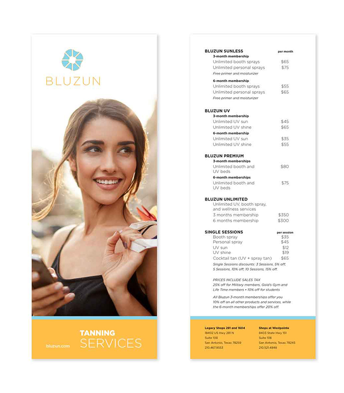
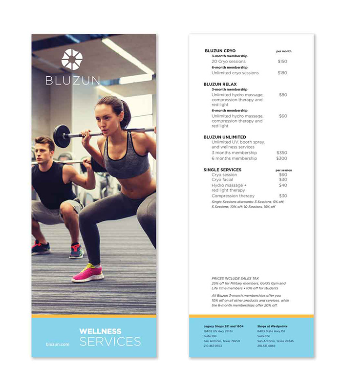
Most services fell into two main categories—tanning and wellness services. Tanning covered all of their previous services while Wellness included cryotherapy, compression therapy, and other new offerings. From these categories, we developed the color palette around yellow for tanning and blue for wellness and cryotherapy. Additionally, a new name—Bluzun—was proposed for this brand. For the identity, we created an abstract blue sun from the forms of tanning beds and cryo chambers.
