Marioli Mexican Cuisine.
Identity | Branding | Collateral | Environmental Graphic Design | Web Design
Accolades:
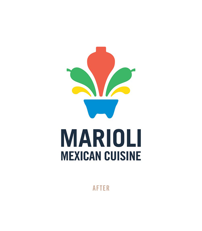
Graphis Design Annual 2019 • Gold • Logo (Marioli Mexican Cuisine)
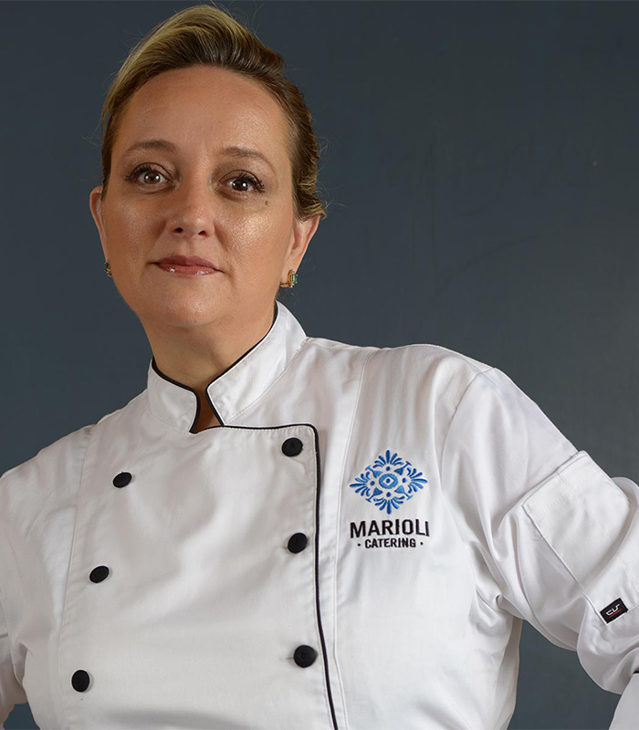
LogoLounge 7 • Published • Logo (Marioli Catering)
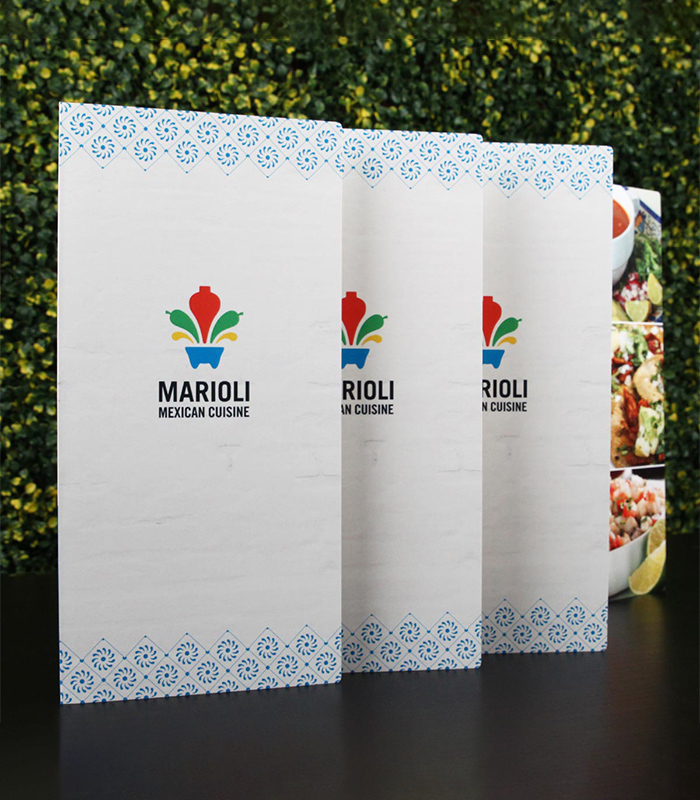
Mexican tradition and culinary innovation.
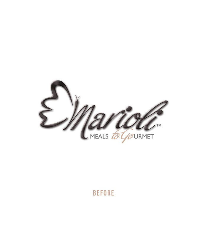
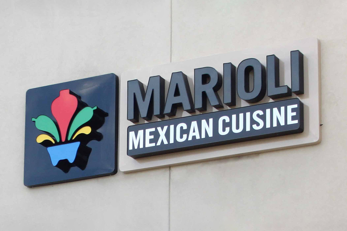
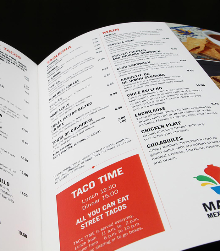
The design project was to rebrand an iconic restaurant in the Northeast of San Antonio—Marioli Mexican Cuisine. The chef and owner, Mariana Oliver, agreed that her new brand had to reflect her authentic approach to Mexican food.
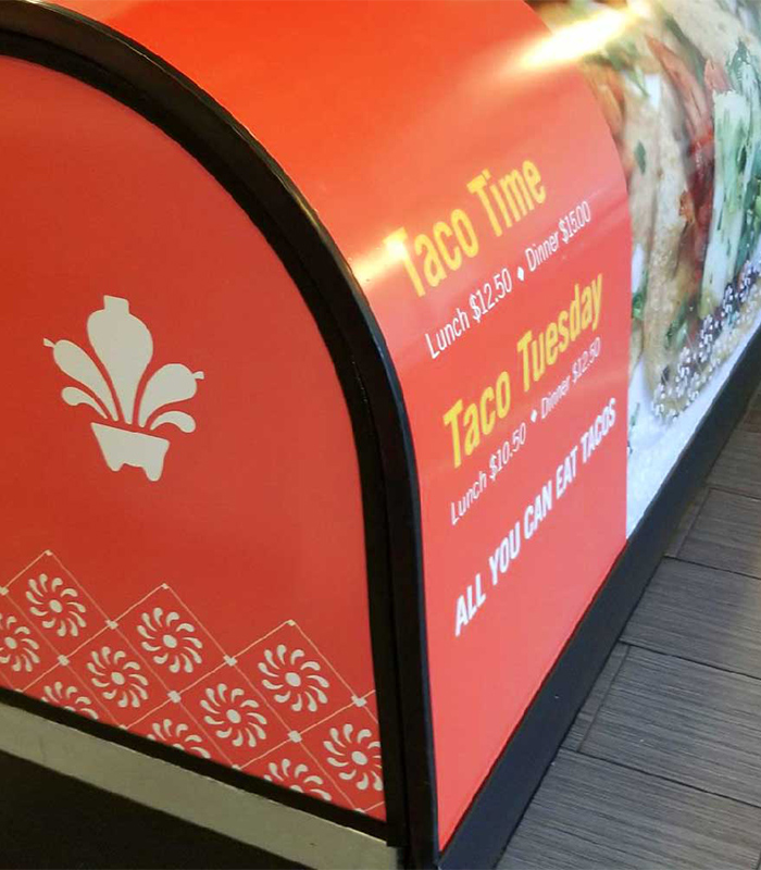
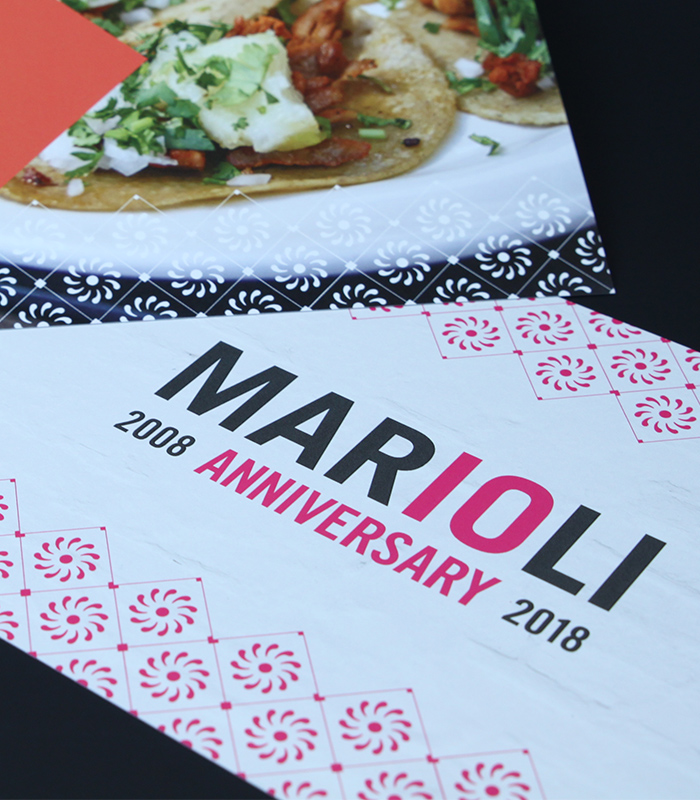
Iconography inspired in Mexican folklore.
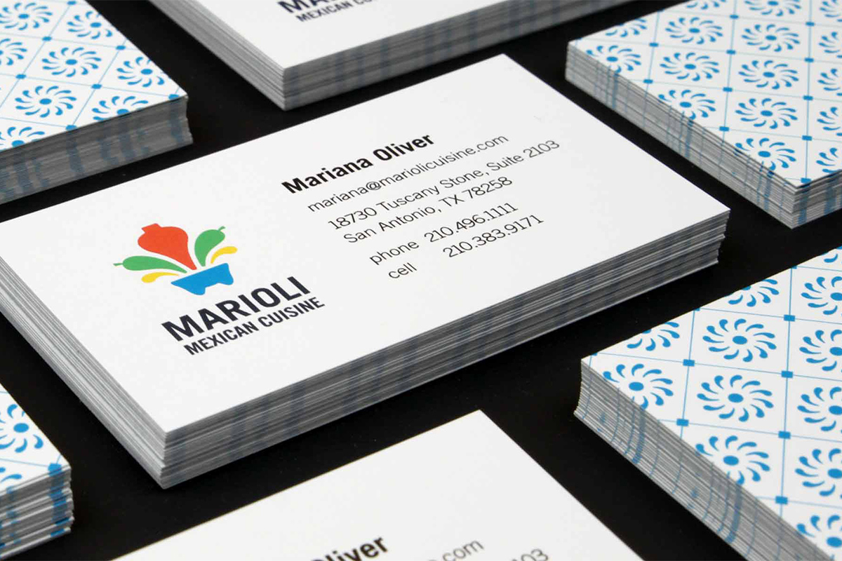
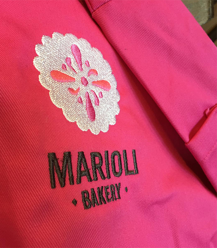
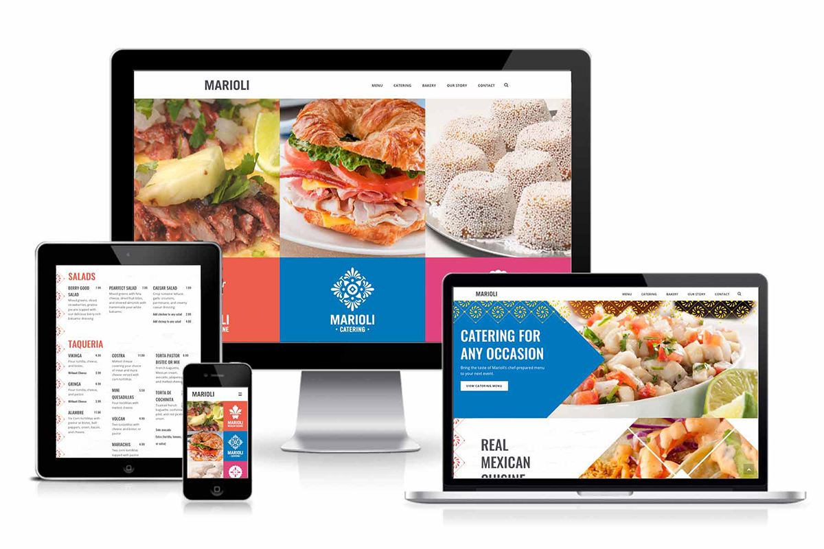
The brand for Marioli is the result of combining forms from traditional Mexican talavera with a graphic representation of Marioli’s mission—create an explosion of flavors. Additional identities were created for the catering and bakery sides of the business. Furthermore, the 10th anniversary celebration was the perfect time to roll-out the new identities. Thus, Marioli’s new brand reflects its commitment to both Mexican tradition and culinary innovation.
